CSS角丸とグラデーションで表現方法を広げてみよう
CSS
CSSで使って要素を角丸にしてみよう
border-radius.html
CSSで要素に対して四方に角丸を設定できるプロパティです。
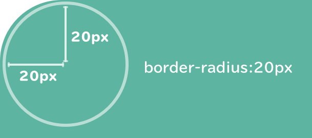
四隅に同じ値の角丸を設定したい場合、以下のように記述します。
半径20pxの正円の円弧をベースにした角丸を実装ができます。
<div class="radius">角丸</div>
.radius {
  width: 200px;
  height: 100px;
  background-color: skyblue;
  border-radius: 20px;
}
四隅に異なる値を設定したい場合は以下のように記述します。
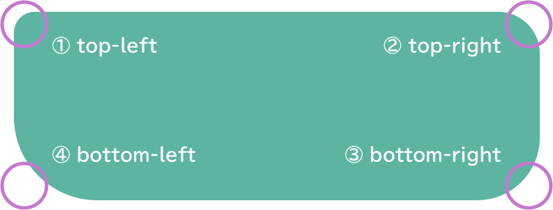
.radius {
  width: 200px;
  height: 100px;
  background-color: skyblue;
  border-top-left-radius: 10px;
  border-top-right-radius: 20px;
  border-bottom-right-radius: 30px;
  border-bottom-left-radius: 40px;
}
ショートハンド
左上、右上、左下、右下の順に記述(左上を基準に時計回り)
border-radius: 10px 20px 30px 40px;
CSSでグラデーション(gradient.html)
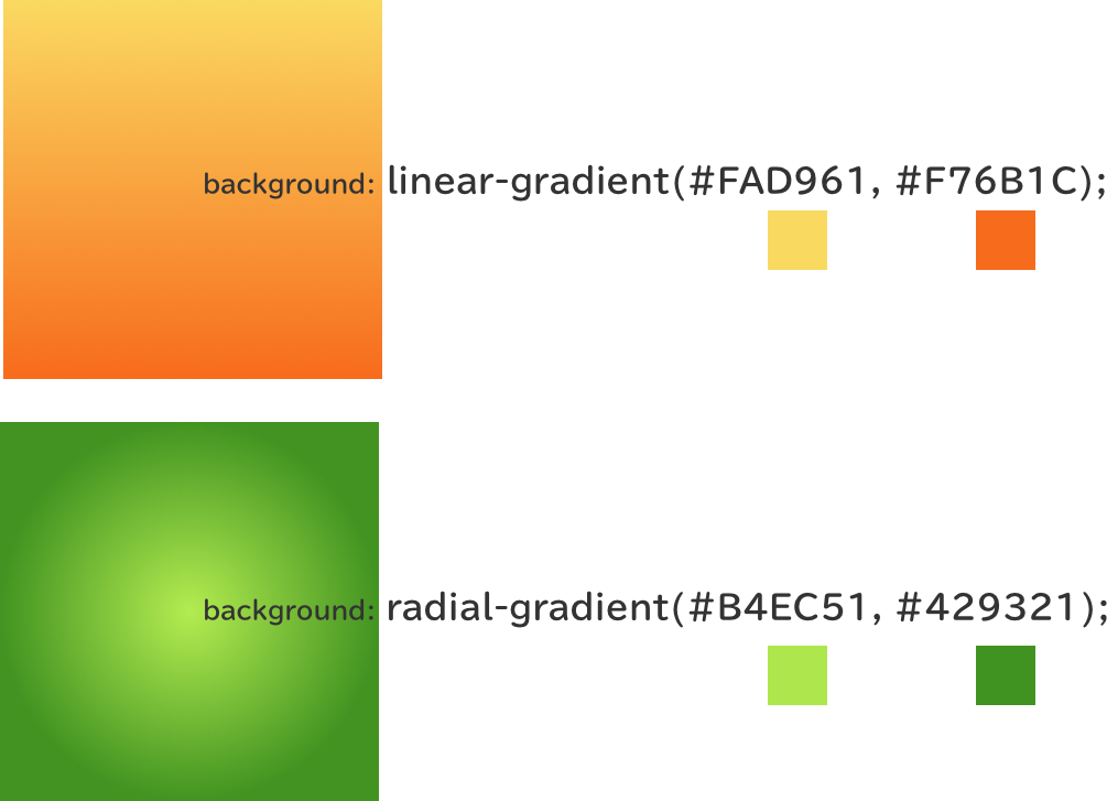
CSSでグラデーションを設定ができます。
デザインのアクセントや要所で使うことがあるので、ぜひ覚えておきましょう。
<div class="gradient">グラデーション</div>
.gradient1 {
  text-align: center;
  width: 200px;
  height: 100px;
  line-height: 100px;
  background: linear-gradient(#FAD961, #F76B1C);
}
グラデーションの方向を設定する
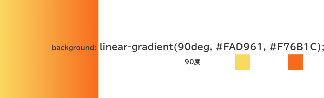
    .gradient1 {
      text-align: center;
      width: 200px;
      height: 100px;
      line-height: 100px;
      background: linear-gradient(90deg, #FAD961, #F76B1C);
    }
deg = degree(デグリー)
90deg ではなく、 to bottom to left to bottom right でも設定ができます。
CSS Gradient Generator
https://cssgradient.io/
Gradient Gallery
https://webgradients.com/