CSSアニメーション keyframesで自由に動かしてみよう
@keyframes と animation プロパティを覚えると、CSSアニメーションにタイムラインの概念で要素をアニメーションさせる事ができ、演出の幅が広がります。
@keyframes は、アニメーション中に到達すべきポイントであるキーフレーム (通過点) を明示することで、CSS animation の流れの中間地点をページ作者が制御することを可能にします。これにより、ブラウザにすべてを自動的に扱わせる場合よりも、アニメーションの流れの中間地点をより明確に制御することができます。
引用:@keyframes – CSS | MDN
@keyframes 任意の名前 {
  0% {
    CSSプロパティ:値;
  }
  100% {
    CSSプロパティ:値;
  }
}
実例
ファイルを用意し(keyframes.html)下記のコードを設定してみてください
<div class="animation"></div>
@keyframes translate {
  0% {
    opacity: 0;
    width: 0;
  }
  100% {
    opacity: 1;
    width: 400px;
  }
}
.animation {
  height: 100px;
  background-color: skyblue;
  animation-name: translate;
  animation-duration: .5s;
  animation-fill-mode: forwards;
}
animation プロパティ一覧
| プロパティ | 説明 |
|---|---|
animation-name |
アニメーションの名前 |
animation-duration |
アニメーションが始まって終わるまでの時間 |
animation-timing-function |
アニメーションの進行の度合い |
animation-delay |
アニメーションが始まる時間 |
animation-iteration-count |
アニメーションの繰り返し回数 |
animation-direction |
アニメーションの再生方向 |
animation-fill-mode |
アニメーションの開始前、終了後のスタイル |
animation-play-state |
アニメーションの再生・停止 |
animation |
8つのプロパティを一括指定できるショートハンドプロパティ |
animation-name
@keyframes で記述した名前を指定します。
このプロパティだけではアニメーションはされません。
animation-duration
例
animation-duration: .5s; → 0.5秒
animation-timing-function
animation-delay
animation-iteration-count
アニメーションの繰り返し回数を指定できるプロパティです。
初期値は、 1
animation-iteration-count: 3; とした場合は、3回アニメーションを繰り返します。
無限に繰り返したい場合は、値に infinite を指定します。
animation-direction
アニメーションの再生方向を指定できるプロパティです。
初期値は、 normal
| 値 | 説明 |
|---|---|
normal |
指定した通り、再生 |
reverse |
逆方向から再生 |
alternate |
順方向、逆方向のアニメーションを交互に繰り返します。 |
alternate-reverse |
逆方向、順方向のアニメーションを交互に繰り返します。 |
animation-fill-mode
アニメーションの開始前、終了後のスタイルの状態を指定できるプロパティ。
初期値は、 none
| 値 | 説明 |
|---|---|
none |
アニメーションの開始前、終了後には適用されません |
forwards |
終了時のスタイルが、そのまま終了後にも適用されます |
backwards |
開始時のスタイルが、開始前にも適用されます。 |
both |
forward と backwards の両方が適用されます。 |
<ul>
  <li class="fill-mode none">none</li>
  <li class="fill-mode forwards">forwards</li>
  <li class="fill-mode backwards">backwords</li>
  <li class="fill-mode both">both</li>
</ul>
.fill-mode {
  text-align: center;
  line-height: 50px;
  height: 50px;
  background: black;
  animation-name: changeBgcolor;
  animation-duration: 3s;
  animation-delay: 10s;
}
.none {
  animation-fill-mode:none;
}
.forwards {
  animation-fill-mode:forwards;
}
.backwards {
  animation-fill-mode:backwards;
}
.both {
  animation-fill-mode:both;
}
@keyframes changeBgcolor {
  0% {
    background: red;
  }
  100% {
    background: orange;
  }
}
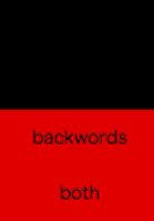
※アニメーション開始前は上から黒、黒、赤、赤ですが、終了後は、黒、オレンジ、黒、オレンジになっています。
animation-play-state
アニメーションの再生・停止を指定できるプロパティです。
初期値は running
running → アニメーション実行
paused → アニメーション停止
ショートハンド
セレクタ名 {
  animation: animation-name animation-duration animation-timing-function animation-delay animation-iteration-count animation-direction animation-fill-mode animation-play-state;
}
セレクタ名 {
  animation: 名前 開始から終了までの時間 進行の度合い 開始時間 繰り返し回数 再生方向 開始前・終了後のスタイル 再生・停止;
}
※順不同
・・・ただし、
animation-duration と animation-delay の2つのプロパティは両方とも秒数で指定するため、最初に記述した秒数が animation-duration で、次に記述した秒数が animation-delay と解釈される。
| プロパティ | 説明 | 初期値 | 値 |
|---|---|---|---|
animation-name |
名前 | none |
任意の文字列 |
animation-duration |
始まって終わるまでの時間を指定 | 0s |
非負の正数(単位は s , ms で指定) |
animation-timing-function |
進行の度合いを指定 | ease |
ease , ease-in , ease-out , linear , cubic-bezier() , step-start , step-end , steps() |
animation-delay |
始まる時間を指定 | 0s |
非負の正数(単位は s , ms で指定) |
animation-iteration-count |
繰り返し回数を指定 | 1 |
非負の正数( 0.5 などの指定も可), infinite |
animation-direction |
再生方向を指定 | normal |
normal , reverse , alternate , alternate-reverse |
animation-fill-mode |
開始前、終了後のスタイルを指定 | none |
none , forwards , backwards , both |
animation-play-state |
再生・停止を指定 | running |
running , paused |